
TIP 8 – Avoid Chart Junk
Stop the Chart Noise: How Clean Visuals Help Leaders See the Story in Seconds

Clean charts beat clever charts. “Chart junk” – all the extra lines, gradients, shadows, icons, and logos – looks impressive at first glance. However, it silently kills clarity and trust. In Finance, Marketing, and Sales, decisions hinge on a few key numbers. Every pixel that doesn’t serve the message is a distraction.
This is from the series of TOP 30 Tips in Data Storytelling.
“If it doesn’t move the eye to insight, it’s not design; it’s decoration.”
Why Chart Junk Is a Real Problem
Chart junk refers to elements in a visual that do not help explain the data.
These include:
3D effects
Heavy backgrounds
Unnecessary icons
Busy gridlines
Too many colours
Cluttered labels
Mixed chart types in a single view also contribute to this issue.
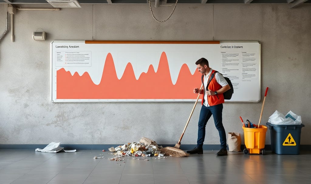
It all increases cognitive load. Stakeholders work harder to see what matters. This effort often causes them to misinterpret or ignore the chart altogether. In dashboards, this issue often appears as “Christmas tree” designs. These designs try to show everything at once: gauges, pies, stacked bars, maps, logos, and more. All of these elements are on one screen.
Example: Finance (FP&A)

Rough Situation: Quarterly Revenue
How not to do it:
You create a 3D column chart for Q1–Q4 revenue. Each quarter has a different bright colour. You add glossy gradients and shadows to every bar. The plot area has a dark background. It also has thick gridlines in both directions and bold data labels above each bar. At a glance, it’s difficult to identify the highest quarter. The 3D angle and visual noise distract from the bar heights.
How to do it:
You switch to a simple 2D column chart. It uses one neutral colour for all bars. There is a single accent colour only on Q4, the highest quarter. The background is white. Gridlines are light and minimal. The axis labels are easy to read. There are no overlapping data labels. A clear title like “2025 Revenue by Quarter (Q4 Highest)” makes the main message obvious within seconds.
This version works better because every visual element is in service of one story: Revenue trend. There’s no competition from decorative widgets. Leaders can see the answer at a glance. They do not need to hunt across a busy dashboard.

A core design principle is to maximize the data-ink ratio: most of what you draw should represent data, not decoration. Clean charts use a small number of colours, minimal lines, and clear labels. They rely on white space and hierarchy, not decoration, to guide the eye.
The goal is simple. When someone glances at your chart, they should grasp the main insight in a few seconds. They shouldn’t have to decode your design choices.
Example: Sales

Rough Situation: Win Rates by Segment
How not to do it:
You show win rates by segment as a 3D exploded pie chart, with four bright, unrelated colours and glossy gradients. Each slice has a percentage label. There is also a legend that repeats the segment names. This means the same information appears twice. The 3D perspective makes it difficult to compare 31% vs 35%, and stakeholders struggle to see which segment actually leads.
How to do it:
You replace the pie with a horizontal bar chart. The chart is sorted from highest to lowest win rate. Use one neutral colour and a single accent on the strategic segment you want to discuss. Segment names sit clearly along the y-axis. Percentages appear once at the end of each bar. There are no gradients or 3D effects. A title such as “Win Rate by Segment (Strategic Leads, Enterprise Lags)” lets people grasp the ranking at a glance.

Leverage new tools, such as Gen AI, to help you quickly.

Gen AI can act like a design assistant. It spots clutter and suggests cleaner alternatives. It can even rewrite the story of your chart.
Ask Gen AI to Critique a Single Chart
Use Gen AI as a “chart coach” by pasting a chart description or screenshot. Then, ask what to remove or simplify. Modern models can read charts and point out unnecessary elements like 3D, gradients, and overloaded labels.
Use Gen AI to Generate a Clean “Before/After” version.
Gen AI can take your data and produce code or configuration for a cleaner, chart‑junk‑free version (e.g., Python, Vega-Lite, Highcharts, or BI tool instructions). You provide the messy scenario; it returns a minimal alternative.
Let Gen AI Rewrite Titles, Annotations, and Layout Guidance
Even when the visual is mostly OK, titles, annotations, and layout often add “verbal junk.” They often fail to highlight the main story. Gen AI excels at turning raw numbers into concise, insight‑first text. This text supports a clean visual instead of cluttering it.
Summary – From insights to action
Chart junk makes your work look busy, not smart. In Finance, Marketing, and Sales, every extra gradient, 3D bar, or decorative icon draws attention away. These elements distract from the insights that actually drive decisions. Clean visuals communicate professionalism, precision, and respect for your audience’s time.
For your next deck or dashboard, choose one busy chart. Ruthlessly simplify it: remove 3D and gradients. Cut extra lines and labels. Standardise colours. Rewrite the title to state the key takeaway.
Run a simple test. If someone can now understand the main message in under five seconds, you have successfully killed the chart junk. You have upgraded your story.
For free resources to help you on your Data Storytelling Journey, click here.
To keep Transforming Your Data Storytelling Journey, sign up for regular Insights.