
TIP 14 – Use Comparisons Wisely
TOP 30 Data Storytelling Tips


Comparisons are one of the fastest ways to make data meaningful
A number on its own often feels abstract, but the moment you compare it with a prior period, a target, or a peer group, your audience can instantly judge scale, change, and significance. You give it a context.
That is why comparison is such a powerful storytelling device in business communication. It gives people a frame of reference. It answers the silent question every executive asks when they see a metric: “Is that good, bad, improving, or risky?”
But comparisons are only useful when they are fair. A misleading benchmark, an incomplete time window, or two groups that are not truly comparable can distort the story and quietly damage trust. The audience may not catch the problem immediately, but once they do, confidence in the whole analysis starts to erode.
Thoughtful comparison does the opposite. It clarifies meaning, sharpens the conclusion, and gives leaders a more reliable basis for action. A good comparison does not just show a difference; it shows a difference that actually matters
This is from the series of TOP 30 Tips in Data Storytelling.
“The Integrity of your story lives in the comparisons you refuse to make .”
Why comparisons matter in financial stories
Finance teams compare performance all the time: actuals versus budget, this quarter versus last quarter, one business unit versus another, or margin today versus margin before a cost increase. These comparisons help leaders see whether a change is noise or a signal, and whether action is necessary now or later.
But the comparison itself shapes the conclusion. Compare a seasonal quarter to the wrong baseline, and you create a false alarm. Compare one region with another without adjusting for market siz,e and you create false confidence. The story becomes less about insight and more about accidental distortion.
In other words, comparison does not just support the story; it defines it. That is why responsible comparison is one of the most important disciplines in data storytelling.
“In data storytelling, comparison is either the thief of context or the source of meaning. The slide decides which one it becomes.”

Example: Finance
Rough Situation: Gross Margin Review
Situation:
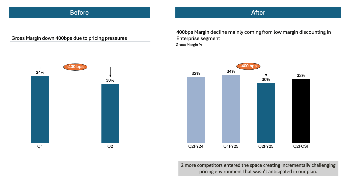
The finance team is reviewing Q2 gross margin. Margin fell from 34% to 30%, and leaders want to understand whether this is a serious problem, what is driving it, and what should be done next.
How not to do it:
Show a title like “Gross Margin Down 4 pts,” with one bar for Q1 and one bar for Q2. Then add a note saying “margin decline due to pricing pressure.” The audience sees the drop, but the comparison is incomplete. Is 30% unusually low? Is it below plan? Is it worse than the same quarter last year? Is a mix shift involved? The slide points at a change without giving the context needed to judge significance.
Even worse, some teams compare Q2 only with Q1 in a seasonal business, where Q1 is always stronger. That creates drama, but not insight.
How to do it:
Choose the comparison that best answers the business question. If leaders want to know whether performance deteriorated structurally, compare Q2 with the same quarter last year and with the plan. If they want to know operational drivers, compare the margin by product mix or customer segment. The goal is not to add more comparisons, but to use the right one.
A strong financial comparison slide might show that Q2 margin is 30%, versus 34% last quarter, 33% in Q2 last year, and 32% budget. Now the audience can see three things at once: this is not just seasonal movement, performance is below plan, and the decline has persisted versus a more valid historical baseline.
Then add one short interpretation. For example: “The 4-point decline is mainly coming from low-margin discounting in the enterprise segment.” That gives the comparison meaning instead of leaving the audience to do the detective work themselves.
The most useful comparisons help people make a fair judgment fast. They reduce ambiguity, not inflate it
Comparisons only become meaningful when they sit inside a bigger context. Looking at a single product’s revenue or margin in isolation often makes the picture look worse or better than it really is.
That is why fair comparisons are never just internal or just external; they are layered. Start with internal performance over time, then add internal relative performance(versus other products or regions), and finally bring in external relative performance versus the market or a close competitor.
Taken together, those comparisons provide a more honest narrative: the business missed its growth ambition, but it outperformed a contracting market and strengthened its position. Context turns raw comparison into a story your partners can actually use.
I have written about this topic as well in this article here.
This core principle is described in my simple training for anyone: The Curious Beginner.
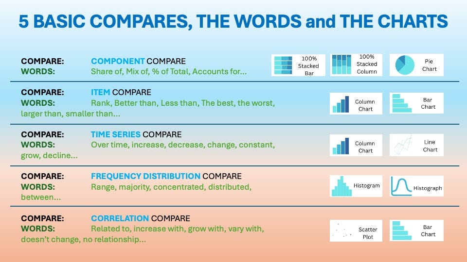
Don’t forget the simple Comparison Framework to Use
5 BASIC COMPARES
“Bad comparisons create drama; good comparisons create decisions. Your job is to know which you are putting on the slide.”
Summary – From insights to action
Comparisons are not decoration in a chart. They are the mechanism that tells your audience whether a number is ordinary, exceptional, improving, or dangerous. When chosen carefully, they make your story sharper and your conclusion stronger.
So next time, take one slide and ask: “Compared with what?” If the answer is weak, the story is weak. But if the comparison is fair, relevant, and clearly explained, you give leaders something far more valuable than a metric: you give them judgment.
Don’t forget to try the free 10 Step Training for Curious Beginner here.
For free resources to help you on your Data Storytelling Journey, click here.
To keep Transforming Your Data Storytelling Journey, sign up for regular Insights.