
Because Comparing Apples, Oranges, and Bananas Shouldn’t Be Boring
The Basics - Stacked Bar Charts


The Item Comparison and its different alternatives
As we discussed in the essential article on Item Comparison, you need to display many items. These items need to be shown in a certain ranking or order. The usual words used with it are: Rank, Better than, Less than, Best of, Larger than, More than, Less than...etc. . You can find it in the world around you every day.
Stacked Bar Charts: If you stack the right things, they will do wonders…in your Data Storytelling journey!

Stacked bar charts are an evolved form of the basic bar chart. They offer an effective way to compare different items and their sub-components, all in one visual. Let’s dive into their history, why they’re a staple in corporate analysis, and how to use them to clarify even the most layered business questions
Stacked bar charts originated as an innovation on William Playfair’s classic bar charts from the late 1700s. They were devised to facilitate more complex comparisons. These charts allow not just for totals between items. They provide an immediate understanding of how subcategories contribute to those totals.
By the 20th century, analysts and business leaders began widely using stacked bar charts in economic research. They also used them in social research. These charts were particularly beneficial whenever grouped comparisons were needed.
I use them sometimes to show if there is more than one component impacting the ranking of items. Decision-makers wanted to see the “big picture” (total value per item) while also “zooming in” to see who contributed what.
“This is a good hybrid between Component Comparison and Item Comparison.”

A stacked approach allows viewers to track both the collective and the parts. For example, they can track total sales by region. They also get a product category breakdown for each region. However, be cautious not to overdo it. This can make the storyline more confusing than helpful to the audience.
Practical Examples from the Corporate World
In the corporate world, stacked bar charts are favored for several reasons:
They let teams compare overall values, such as sales volume by department. They also clearly display how product lines, customer segments, or sales channels contribute to the total.
Visualizing contributions from subcategories (think: sales by region sliced by product line) uncovers hidden trends and informs precise strategy.
With one chart, executives spot not just winners and losers, but the deeper reasons behind performance.
Example:
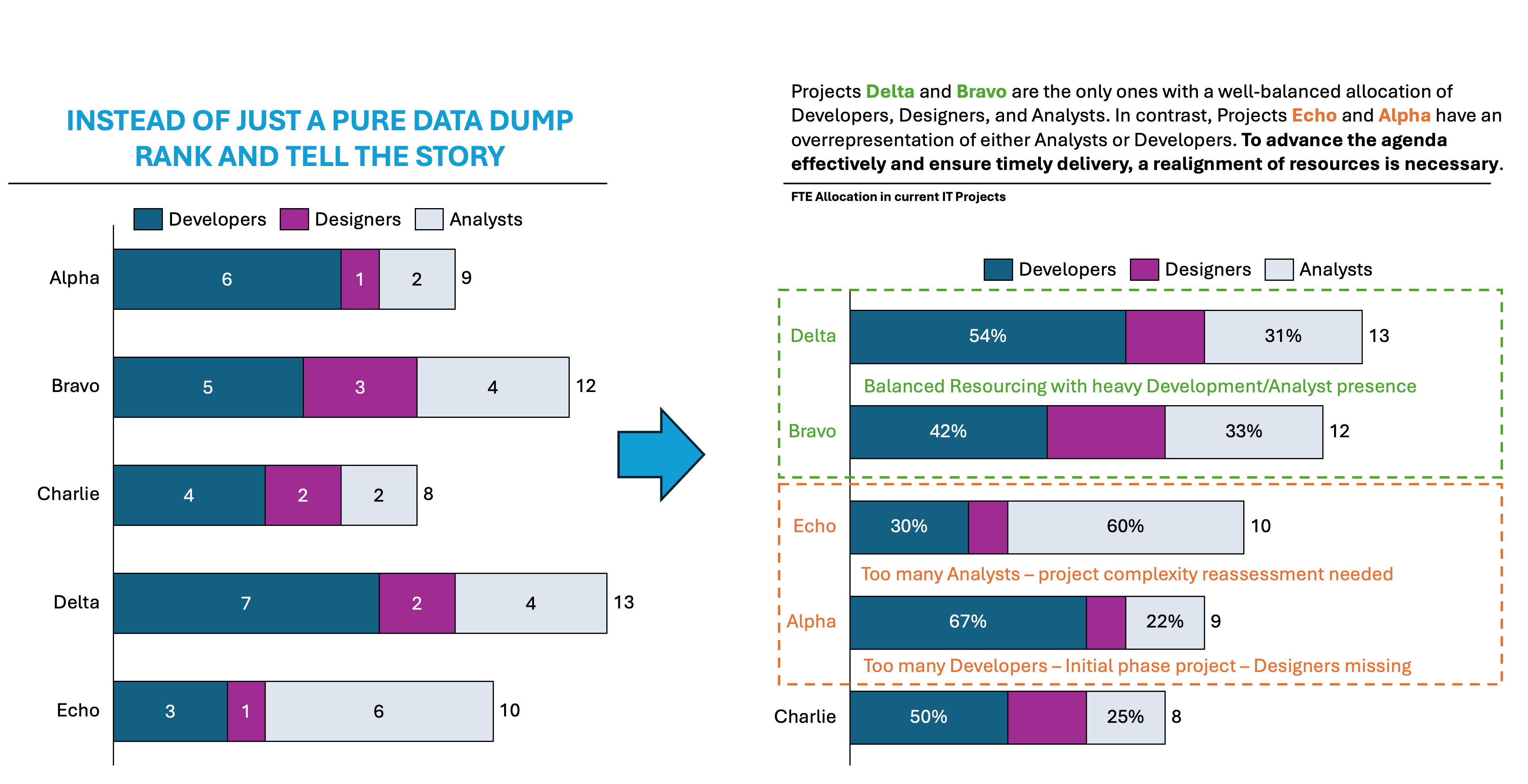
Imagine a manufacturing company, “Let’s do it Inc.,” where the IT department is currently running five projects: Alpha, Bravo, Charlie, Delta, and Echo. Leadership is reviewing resource allocation from the perspective of both quantity and the mix of staffing.
During the analysis, leadership has found out the following:
Project Echo: Need for More Balanced Roles
Echo’s team composition consists of 3 Developers, 1 Designer, and 6 Analysts. This signals a heavy reliance on analysts. It is twice the number found in any other project. This likely reflects a project with exceptional complexity, regulatory requirements, or intensive data processing needs.
Why this is a concern: Development output may lag if too few developers are available for implementation. The lone designer is likely overextended, leading to potential bottlenecks in UI/UX and documentation phases.
Resource realignment actions: Leadership should consider assigning 1–2 more developers to Echo to maintain momentum and prevent delays. Additionally, providing another designer will improve efficiency, reduce rework, and ensure better user-driven outcomes.
Project Alpha: Need for More Designers
Alpha’s staffing, comprising 6 Developers, 1 Designer, and 2 Analysts, indicates that the team is developer-heavy, with minimal design capacity.
Why this is a concern: Developers may be forced to tackle UX/UI themselves. This situation slows progress and risks subpar design outcomes. With such a skewed distribution, the single designer could quickly become a bottleneck as the project scales.
Resource realignment actions: Adding at least one, possibly two, skilled designers to Alpha will relieve pressure. It will enhance creativity and yield a much higher-quality end product. This change allows developers to focus on coding efficiency.
👉🏻 Advantages
Compactly displays totals and parts: One chart delivers layered insight—totals PLUS subcomponent details.
Part-to-whole visualization: Quickly reveals category contributions to a whole.
Space-saving: Reduces dashboard clutter compared to multiple single-series charts.
Easy group comparison: Patterns across items and sub-items emerge at a glance.
👉🏻 Disadvantages
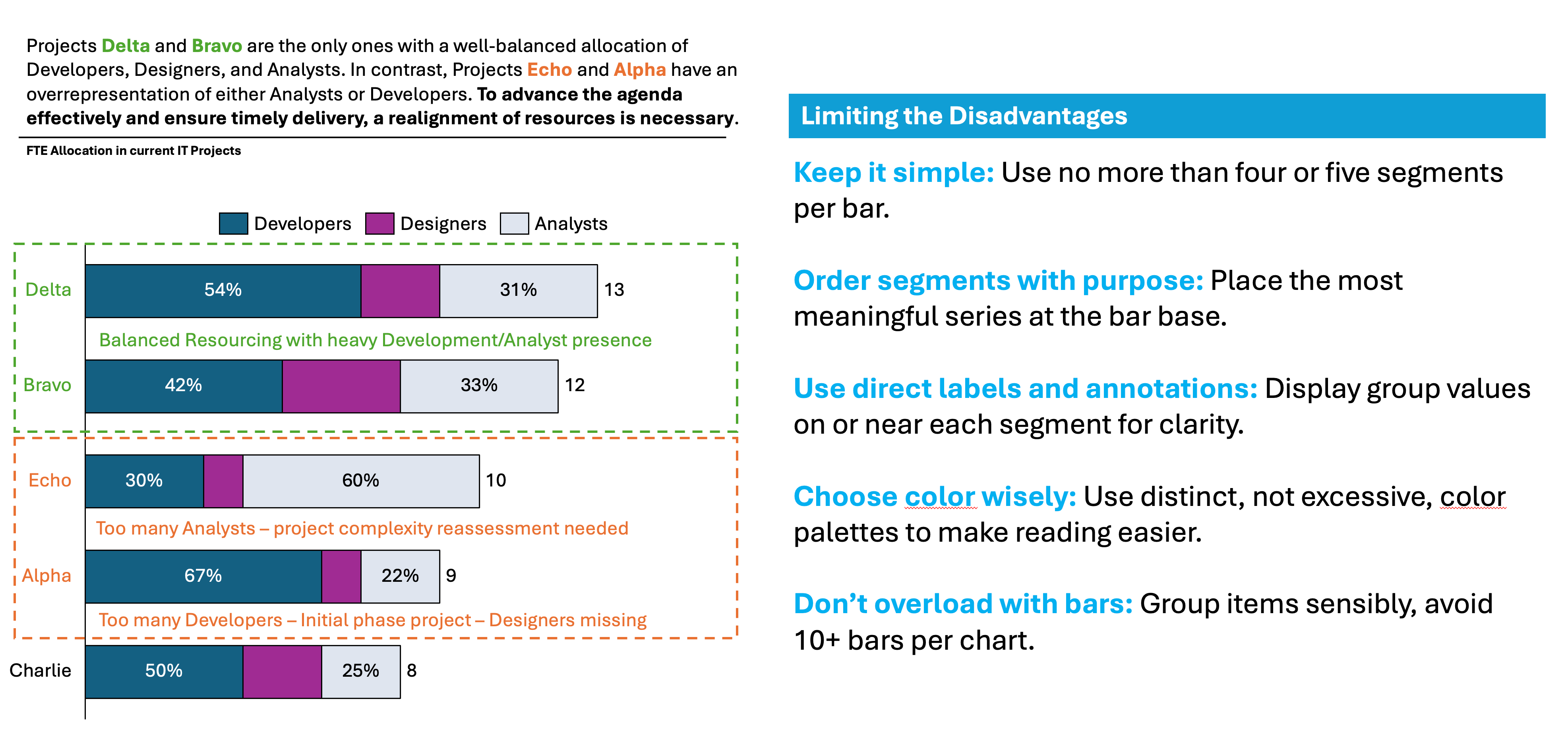
Harder to read with too many subcategories: Charts with 4+ segments per bar get cluttered.
Baseline problem: Only the lowest segment aligns to a common baseline, making higher group comparison less accurate.
Small values disappear: Smaller sub-groups can be lost amid large stacks.
Misinterpretation risk: Novice viewers may see only the tallest bar, missing part-to-whole stories.
Practical Tips to Reduce the Disadvantages
There are always creative ways to help yourself avoid the pitfalls, depending again on the story you choose to tell. Not every piece of data is essential, and not everything needs to be visible or communicated. I have added some tips I’ve learned during my professional journey on the right side of the image below.
Are there other alternatives?
Of course, in the future posts I am going to talk about various other visually appealing alternatives!
Visualizations and their use cases, we have already talked about in Component Compare:
100% Stacked Column Chart
100% Bar Chart
Pie Chart
Doughnut Chart
Area Chart
Mekko Chart
Treemap Chart
Sankey Chart
Area Bump Chart
Sun Burst Chart
Visualizations and their use cases, we have already talked about in Item Compare:
Bar Chart
Summary
Stacked bar charts are more than just colorful visuals; they’re a dynamic tool. They compare both totals and the factors that shape them. Use them thoughtfully to unlock layered business insights, summarize multifaceted stories, and guide data-driven decisions. Remember to minimize clutter, keep segments concise, and always align your design with the key question.
Ready to bring more context and clarity to your reports? Try the stacked bar chart on your next project breakdown, and transform complexity into compelling action.
For a free downloadable essential resources for your Data Storytelling journey, click here: Free Downloads
And of course, if you want to keep transforming your Data Storytelling skills, subscribe to regular updates to your inbox!
I like the summary: Stacked bar charts are more than just colorful visuals; they’re a dynamic tool. They compare both totals and the factors that shape them. Use them thoughtfully to unlock layered business insights, summarize multifaceted stories, and guide data-driven decisions.
You have a great example in the piece.
Worth the time to read it.